Sir Gawain and the Green Knight
A book layout I created for the poem Sir Gawain and the Green Knight, written by the anonymous Pearl Poet, translated and adapted by Simon Armitage. A favourite book of mine, this story of adventure, romance, mystery, and dread has many translations, and I pulled inspiration from some of those I have read over the years into the design of this book. Through the use of creative typesetting, I wanted to evoke the tension of Gawain’s journey towards his expected death as the poem progresses.
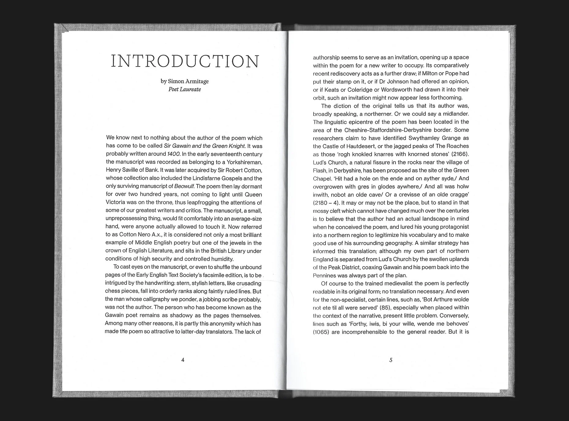
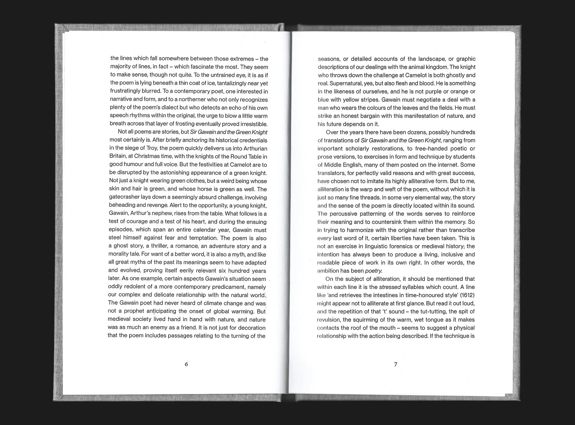
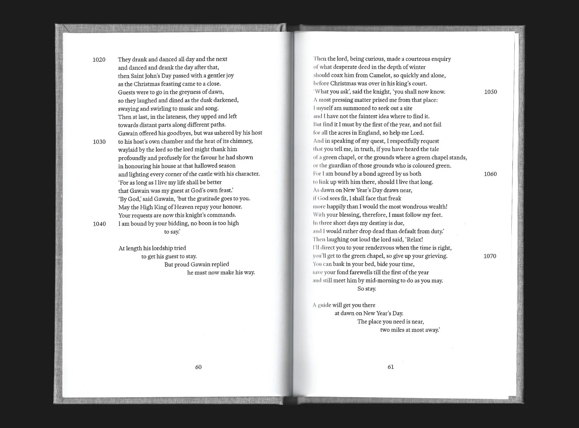
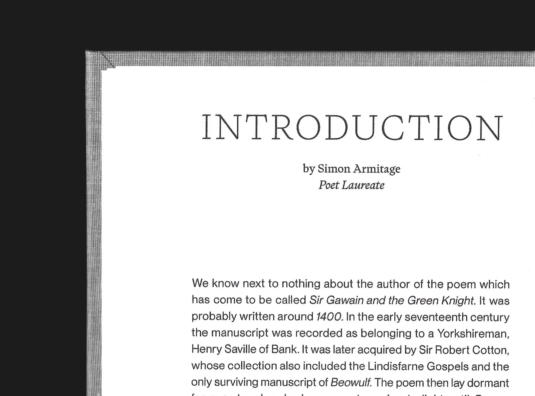
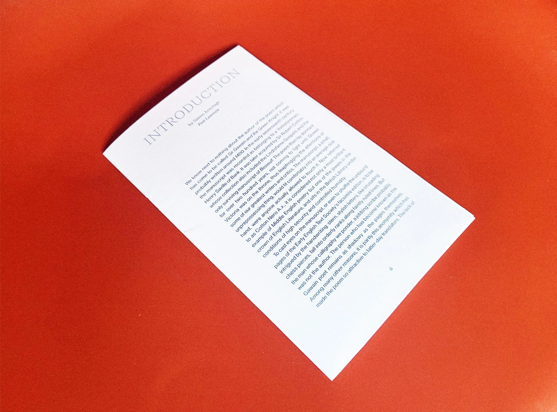
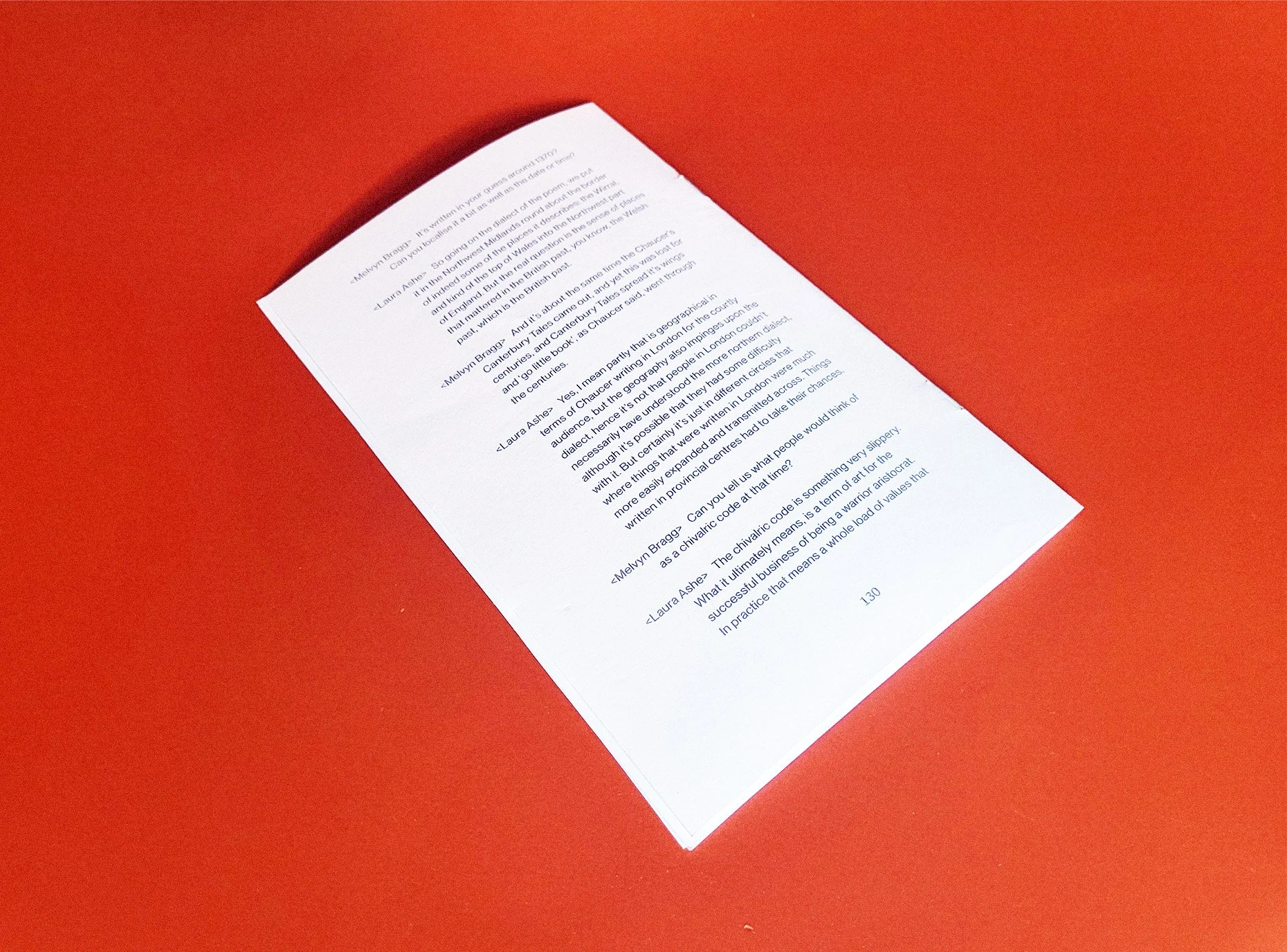
This book has three distinct sections: An introduction, followed by the translated poem found in Armitage’s Faber edition, and a transcribed discussion taken from BBC Radio 4’s In Our Time show. Each section is set in a different way but follows the same baseline grid. The Introduction follows quite a formal, justified layout which then gives way to the much more open and rhythmic Poem. The Discussion is set to read in a more informal manner to the Intro, to feel more conversational.
The final layout was printed as a hardback book with dustjacket. The cover layout nods to the near hapless journey Gawain makes to his doom, and the division between the titular characters.
Client: Concept
Type of Work: Publication, Layout
Medium: Print, Paper
Typefaces: PP Writer, PP Neue Montreal

1/12

2/12
3/12
4/12

5/12
6/12
7/12
8/12

9/12
10/12

11/12

12/12
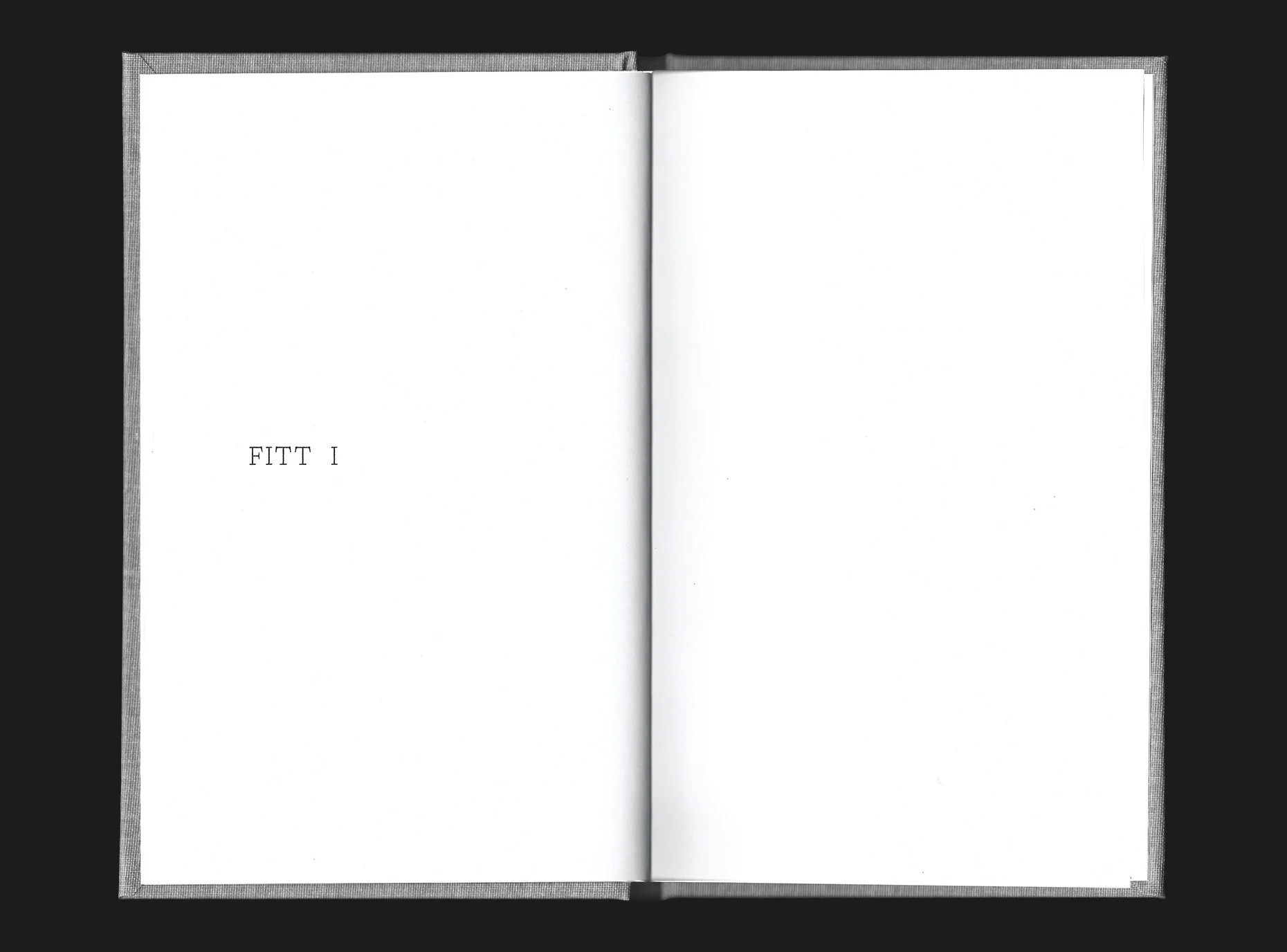
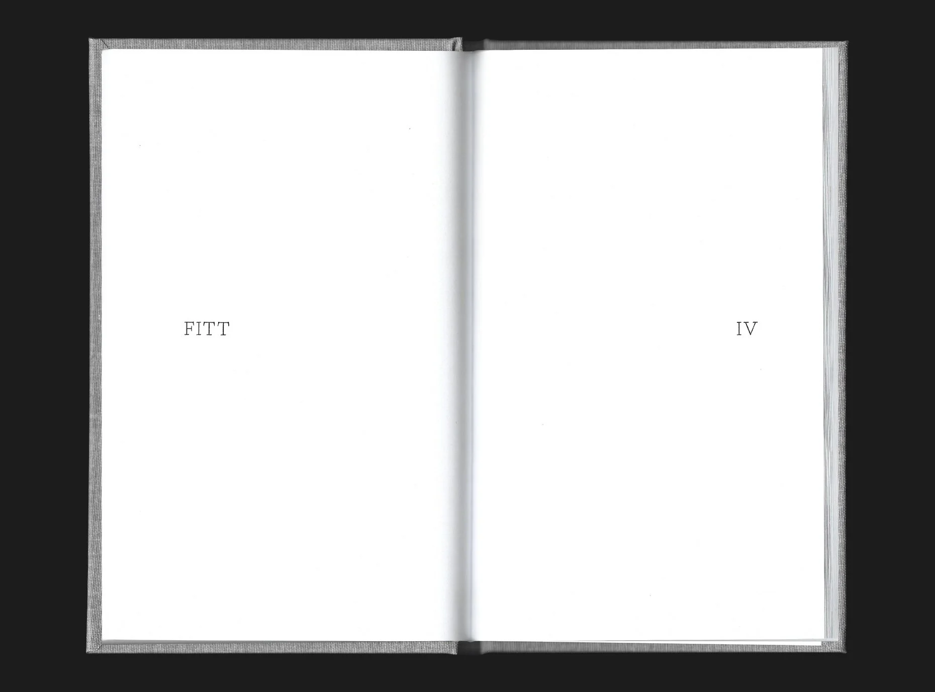
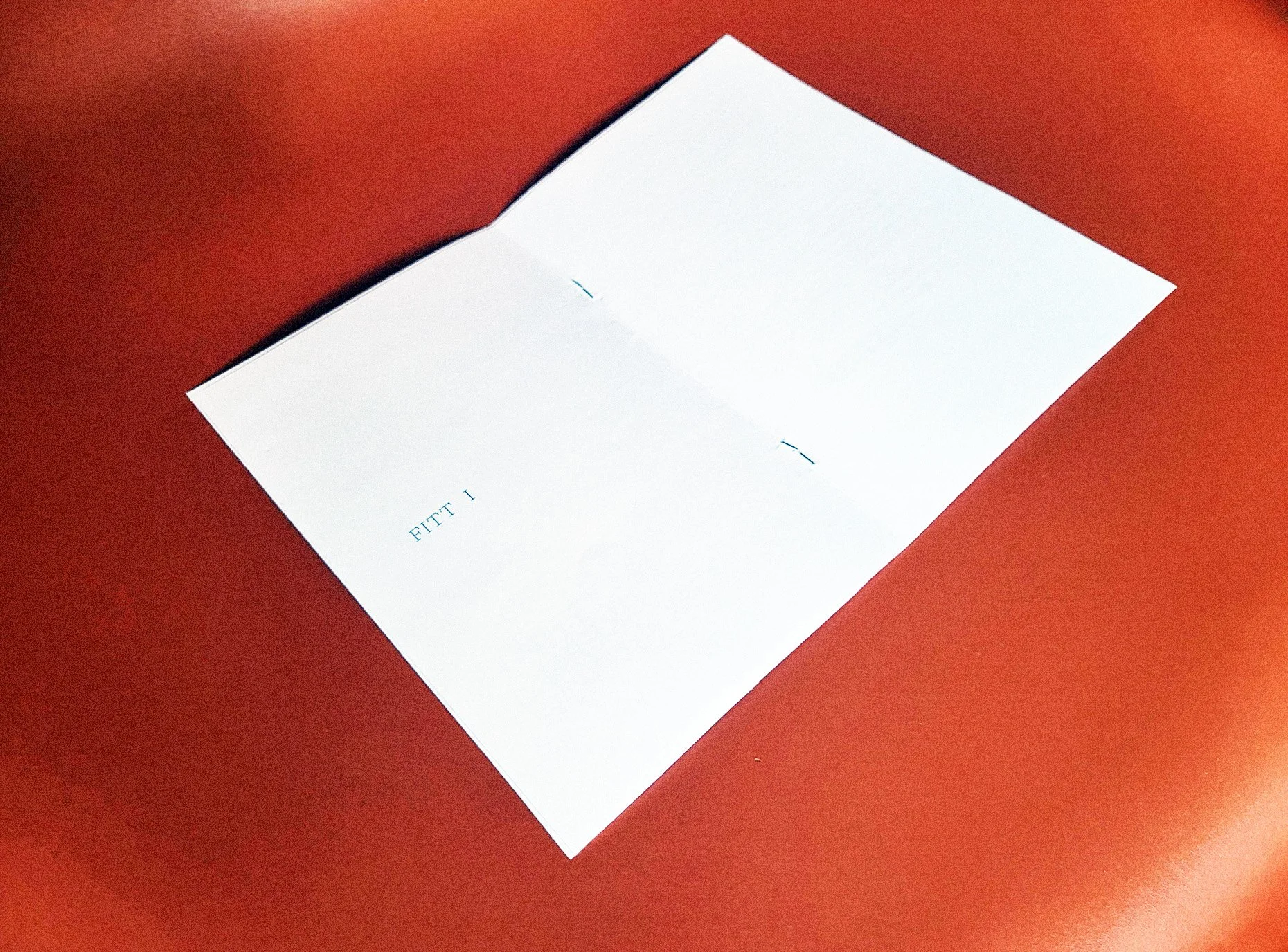
The Poem is written in four ‘Fitts’—four parts. Each Fitt takes place in a different stage of Gawain’s journey, both mentally and physically as he traverses the wilderness to find the Green Chapel. Inspired by fantasy and adventure novels which often include illustrated maps, I wanted to somehow visually represent the journey he takes and the tension he experiences. As there is still debate over where the novel takes place—many think Wales or North West England—I didn’t want to use an incorrect map. My solution was type based, and has the Fitt number progress across the spread in each part, towards the final confrontation.

1/5

2/5

3/5
4/5
5/5
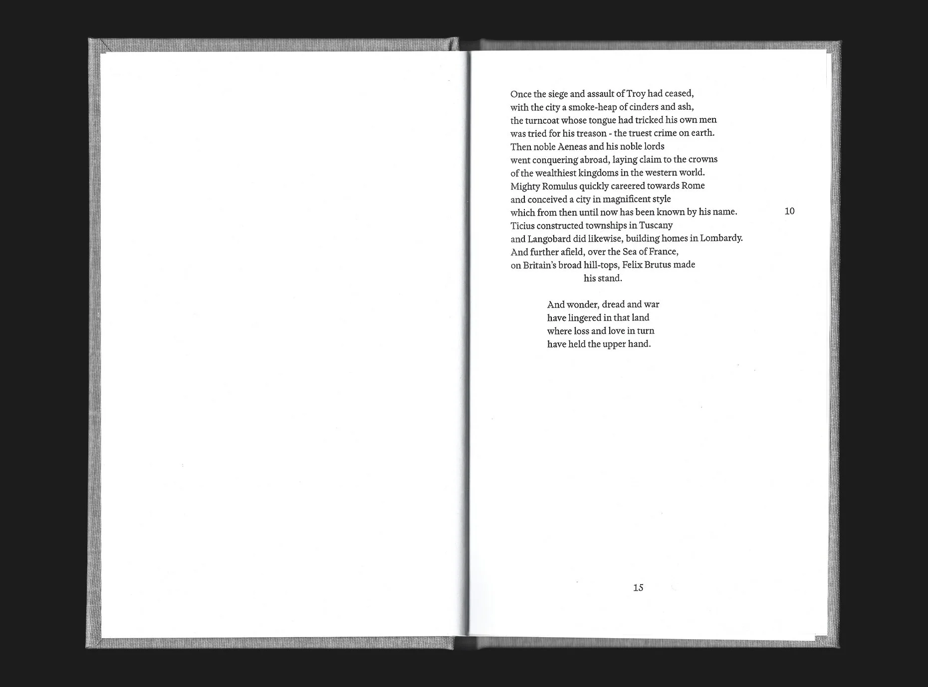
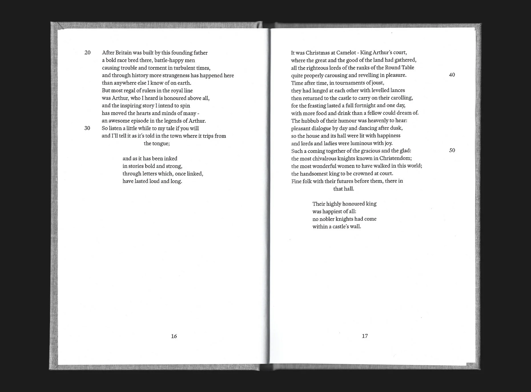
Every stanza in the poem ends with five lines called a ‘Bob-and-wheel’. The short ‘Bob’ followed by the ‘wheel’—four rhythmic lines. I was intrigued by the wheel, as it serves as a summary to the stanza you had just read, or as a bridge to the next stanza, almost like a little cutscene to progress the story. Where the majority of the stanza is written in alliterative verse, the wheel disrupts this with rhyme and a noticeable rhythm.
I identified this as an opportunity to disrupt the stanza further, to quicken the pace or slow it down and build tension at different junctures of the story. For example, as Gawain is close to the Green Knight, I doubled the leading of the wheel out so that it reads slower and with more impact. When Gawain is anxious to keep to his schedule I indented the lines to help the reader’s eye reach the start of each line faster, to experience that hurried anxiety.

1/3

2/3
3/3
Two typefaces are used in this book. The first: PP Writer by Pangram Pangram foundry, is used in the body of the poem, and in titles and page furniture. I chose this as it feels elegant and traditional, rooted in the past; despite this, it has a slight edge to it with sharp strokes. I own an old copy of The Green Knight translated by J. R. R. Tolkien, which is set in Plantin, the typeface feels old, but is very legible. I found PP Writer to be a close match to Plantin in many ways, evoking that adventure novel feel but with the sharp strokes giving it a slightly more modern look to fit Armitage’s contemporary adaptation.
I paired this with another Pangram typeface: PP Neue Montreal. This sans-serif was used in the introduction and discussion sections to provide contrast to the poem, and it has the same x-height as PP Writer ensuring the sizes complimented each other. I had used Neue Montreal before in print, and find it super clean and legible, with great versatility owing to a large amount of weights in the family.
1/3
2/3

3/3
Process
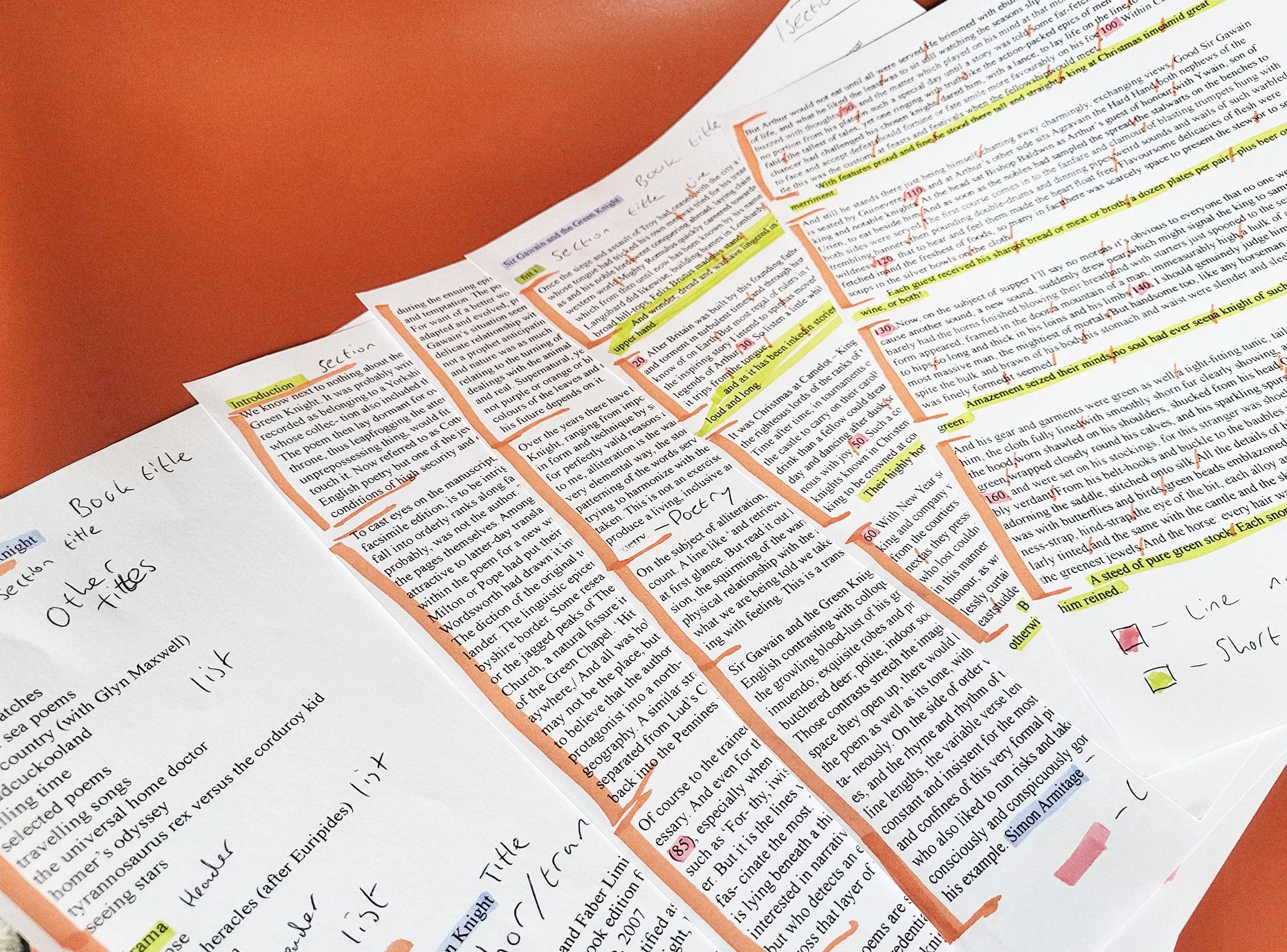
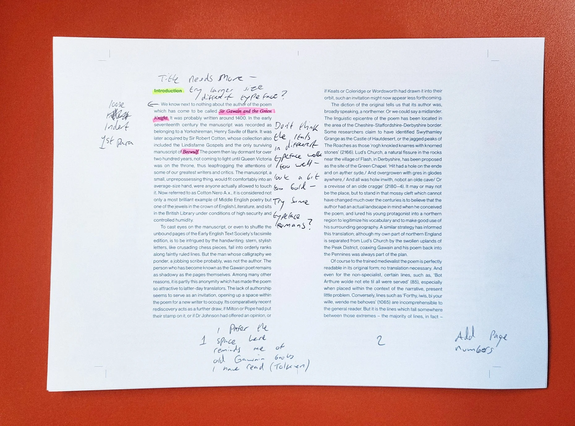
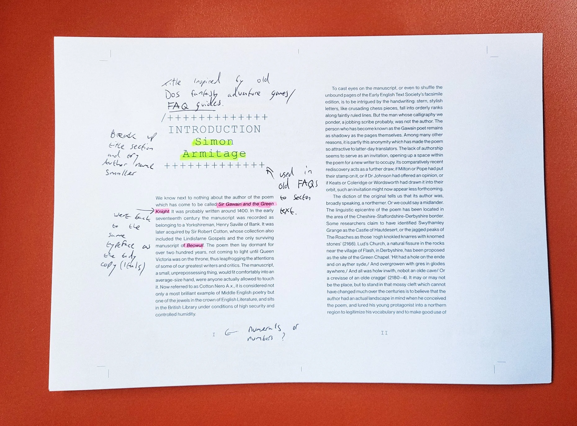
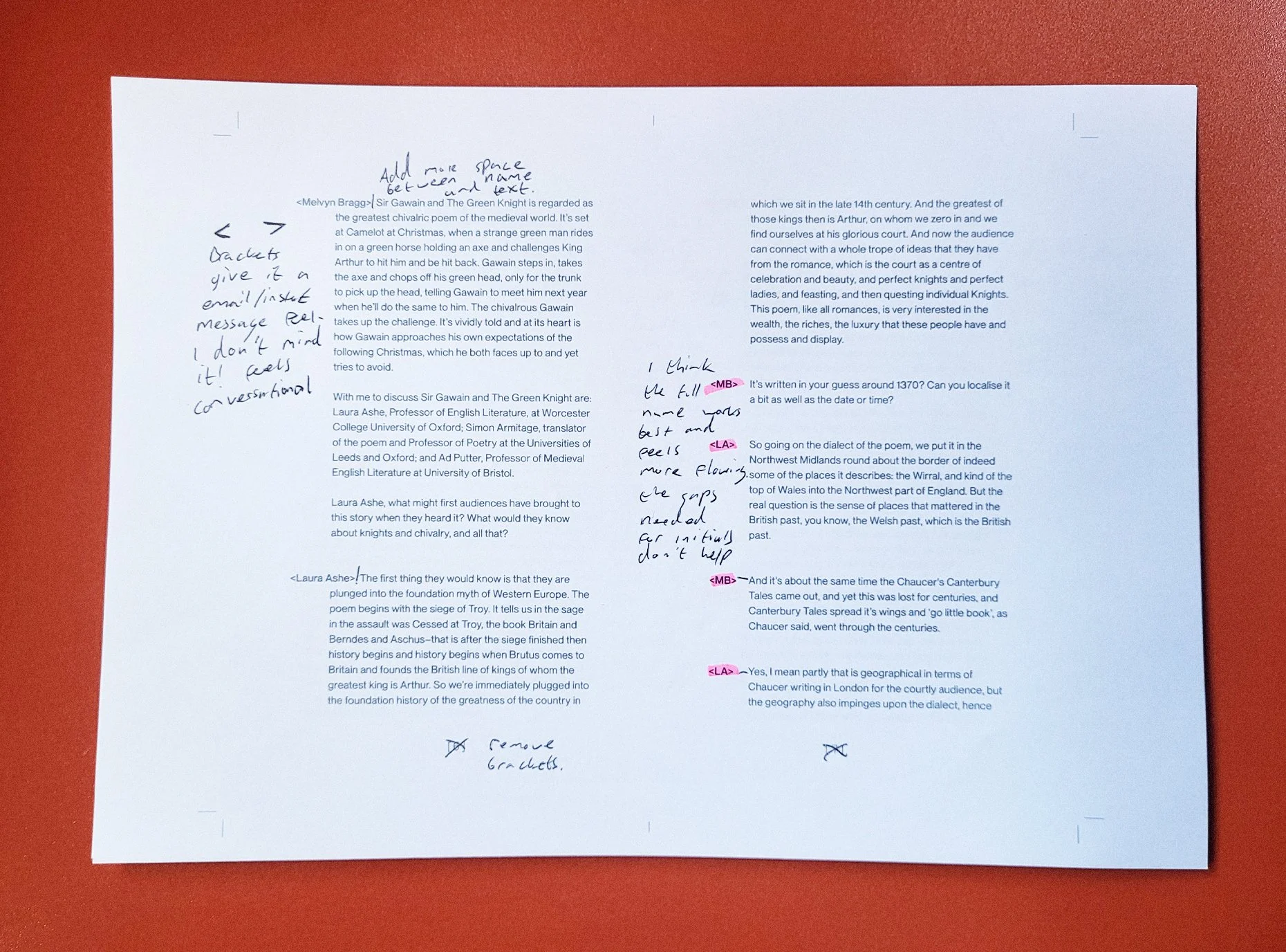
To begin the design process, I print examples of the raw copy to markup and make notes on, allowing me to identify key sections and text elements. When I take the copy into Adobe InDesign to begin creating the layout, the markups help me to start formulating a hierarchy and experiment with paragraph and character styles.
Once I have started working on the layout, I also print off iterations as I make changes, to see how it is looking in physical print. There is then a feedback loop to progress the project, marking-up each new version and making alterations in InDesign.

1/9
2/9
3/9

4/9

5/9

6/9

7/9

8/9
9/9
Once I am happy with the layout and styles, I set the baseline grid. The method I was taught for setting up a grid results in a baseline increment every *0.5 of the body leading. The gutters are set to *1.5 of the leading. The cap-height of the body copy will be flush with the top of each increment. I find this to be a very tight and neat system when laying out type, and it gives me good control when introducing other elements to the page, such as titles and images, to ensure everything lines up nicely.
This layout has six columns in all sections, the body copy spans five with the sixth column being used in the poem to contain the line numbers.

1/2

2/2
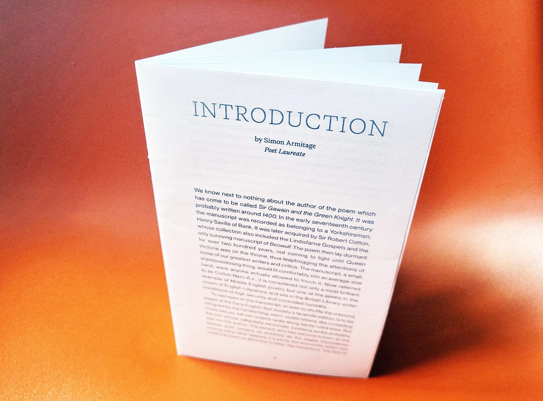
With everything laid out and finalised in InDesign, before sending to final print, I created a small saddle stitched booklet, cut down to the correct size. This was to get one final look at the design to make sure the layout is working as intended when printed and folded.
1/7
2/7

3/7

4/7
5/7

6/7
7/7
Additional Images of the Final Publication

1/4

2/4

3/4

4/4